Interactive Energy Assistance Dashboard

A data visualization showing county-level census statistics alongside energy poverty levels and access to energy assistance funding.

User Experience Design, Product Strategy, Data Analytics

illustrations illustrations
post-thumb A data visualization showing county-level census statistics alongside energy poverty levels and access to energy assistance funding.

Colorado’s energy assistance programs meet only a fraction of the need in most of the state, so when trying to get more funding from the legislature we came up with the idea to make one-page, county-level statistics and hand them out to lawmakers who represented that area.

This was a tedious, manual process of design and data gathering, so I worked with volunteer developers to create an interactive visualization of assistance funding vs. level of need across the state. Users could select a county, get historical data about energy poverty alongside census data about income, households, and demographics. This was coupled with a specific print style, allowing any user to generate their own one-page report of a counties statistics.


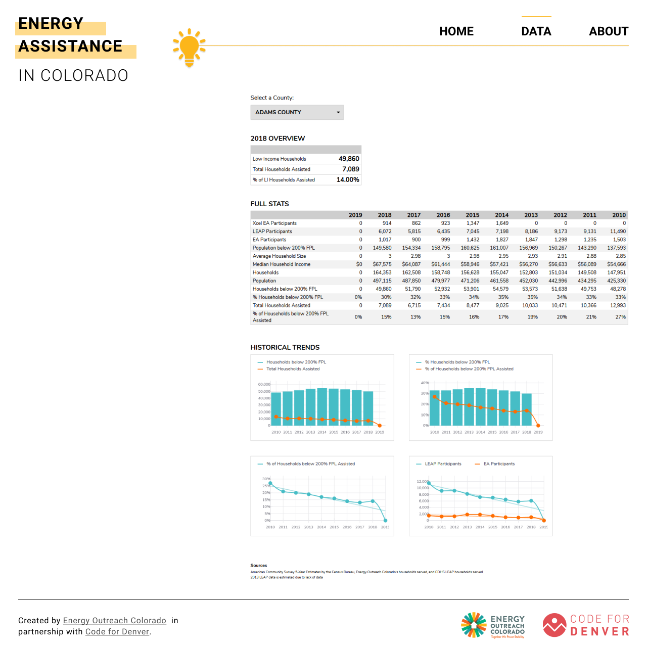
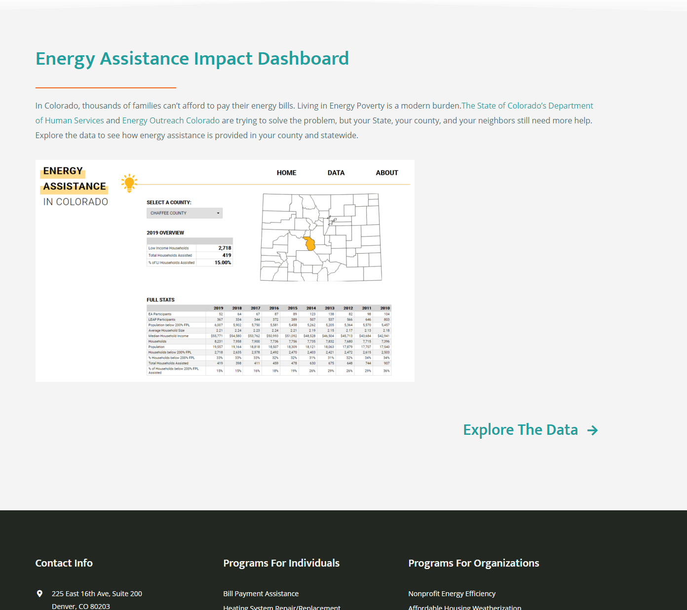
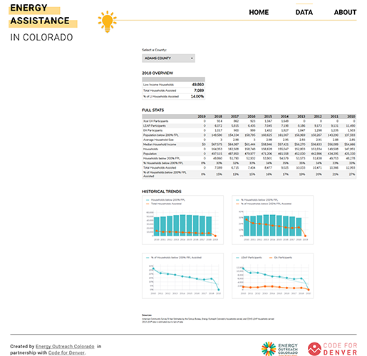
Because of this project's accessibility, we successfully convinced many lawmakers that their constituents needed more help than they were getting from the state which resulted in increased statewide investment into energy assistance.

Screenshots